

Contact form optimization means making your website forms easier, faster, and more inviting for visitors to complete. This includes improving the number of fields, layout, placement, loading speed, call-to-action text, trust signals, tracking setup, and ongoing testing.
It matters because even small issues can stop people from submitting a form. A form with too many required fields, unclear instructions, slow loading, weak button text, poor mobile design, hard-to-find placement, or no privacy reassurance can lead to fewer inquiries. This is especially costly when you are paying for traffic through PPC campaigns.
A strong contact form should only ask for the information needed to start a useful conversation. In most cases, this includes name, email, message, and sometimes the type of inquiry. Extra details like phone number, budget, or timeline should be optional unless they are truly necessary.
The best contact forms are simple, mobile-friendly, fast, easy to scan, and clearly show which fields are required or optional. They should also include trust signals, appear in places where visitors are ready to take action, and be tracked through tools like Google Analytics, CRM integrations, heatmaps, and form analytics. Over time, the form should be improved through A/B testing and regular performance reviews.
What is contact form optimization?
Contact form optimization is the process of improving the layout, fields, copy, tracking, validation, trust signals, and follow-up workflow of a website form so more qualified visitors complete it.
It is not just about making the form shorter. A three-field form can still perform poorly if the CTA is vague, the page feels untrustworthy, the form breaks on mobile, or the submission never reaches the right person. A longer form can sometimes work well if the information requested is relevant, clearly explained, and presented in a way that feels easy.
The core goal is to reduce unnecessary effort. W3C’s Web Accessibility Initiative recommends asking only for information required to complete the user’s task, noting that irrelevant or excessive data makes people more likely to abandon a form. W3C also highlights clear labels, instructions, validation, notifications, and multi-page forms as important parts of accessible form design.
For lead generation websites, contact form optimization should answer three questions: Can visitors complete the form easily? Do they trust what happens after they submit it? Can your team measure and follow up on the inquiry properly?
Why does contact form optimization matter for lead generation?
Contact form optimization matters because it helps businesses generate more inquiries from traffic they already have. Instead of increasing ad spend, publishing more pages, or chasing more clicks, businesses can often improve results by removing the points where interested visitors hesitate or drop off.
A form is usually one of the final conversion steps on a website. By the time someone reaches it, they may already understand your offer, compare your services, and decide whether to contact you. If the form feels demanding, unclear, or risky, that intent can disappear quickly.
This is especially important for PPC campaigns. Paid traffic often lands on focused service pages or landing pages where the form is the primary conversion action. When the form underperforms, cost per inquiry rises. When the form converts well and sends accurate data into analytics and CRM systems, PPC campaigns become easier to optimize around real business outcomes.
The form also affects lead quality. A poorly designed form may generate more submissions but include spam, vague requests, incomplete contact details, or leads with no fit. A well-optimized form balances completion rate with qualification by asking for the right information at the right time.
What fields should a high-converting contact form include?
A high-converting contact form should include only the fields needed to start a useful conversation. For many businesses, the essential fields are name, email address, message, and sometimes a service or inquiry type dropdown.
Phone number can be valuable, but it should not always be mandatory. Some visitors are comfortable with email first, especially if they are early in the buying process. If you make phone number required, explain why. For example, “Phone number helps us respond faster” feels more reasonable than simply forcing the field without context.
Fields such as company name, budget, timeline, location, project type, or preferred contact method can be useful when they help your team route, qualify, or personalize the response. They become friction when they are collected out of habit rather than necessity.
A simple field audit can help: ask, “Do we need this before the first conversation?” and “Will this help us respond faster or better?” If the answer is no, remove the field, make it optional, or move it to a later stage.
Baymard’s UX research on checkout forms found that the number of fields users must consider has a major impact on perceived complexity. Although checkout forms are different from contact forms, the principle applies directly: every additional field creates another decision, another potential error, and another moment of hesitation.
How can you reduce form friction without lowering lead quality?
You can reduce form friction without lowering lead quality by separating essential information from helpful information. Essential fields should stay visible and easy to complete. Helpful but nonessential fields should be optional, conditionally displayed, or collected after the first inquiry.
Conditional logic is especially useful. For example, if someone selects “Website redesign,” the form can show a project timeline field. If someone selects “PPC management,” it can show a monthly ad spend range. This keeps the form relevant instead of forcing every visitor through the same set of questions.
Optional fields can also improve lead quality without blocking submissions. A field labeled “Tell us anything helpful about your project” invites context without making visitors feel trapped. A budget field can be framed as optional with microcopy such as “Optional, but helpful for recommending the right approach.”
Multi-step forms can work when the request requires more information. W3C recommends dividing long forms into smaller logical steps when needed and informing users about their progress. This can make a complex form feel more manageable, especially for quote requests, consultations, or service assessments.
The key is to avoid confusing “more information” with “better information.” A qualified inquiry does not always require a long form. It requires enough context for the next step.
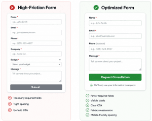
How should contact forms be designed for mobile users?
Contact forms should be designed for mobile users with a single-column layout, large tap targets, readable labels, and fields that are easy to complete without zooming or excessive scrolling.
Mobile users are often multitasking. They may be comparing providers, clicking from ads, or trying to contact a business quickly. A form that feels acceptable on desktop can become frustrating on a small screen if fields are cramped, labels disappear, buttons are hard to tap, or the keyboard covers important instructions.
Use the correct input type for each field. Email fields should trigger an email keyboard. Phone fields should trigger a numeric keypad. Dropdowns should be short and easy to scan. Long lists can feel clumsy on mobile, so use radio buttons, segmented choices, or predictive search when appropriate.
Page speed also affects the form experience. Google describes Core Web Vitals as metrics that measure loading performance, responsiveness, and visual stability, and recommends good performance for both search success and user experience. For PPC landing pages, a slow page or unstable layout can hurt the visitor experience before the user even reaches the form.
A strong mobile form feels calm, clear, and predictable. Visitors should know what is required, what happens next, and how to complete the form without fighting the interface.
Why do clear labels, microcopy, and validation improve completions?
Clear labels, microcopy, and validation improve completions because they reduce uncertainty. Visitors are more likely to finish a form when they understand what each field means, why information is being requested, and how to fix mistakes.
Labels should remain visible even after the user starts typing. Placeholder text can help, but it should not replace a proper label because it disappears once text is entered. W3C recommends using labels to identify each form control and providing instructions that help users complete both the form as a whole and individual fields.
Microcopy is small but powerful. A sentence like “We’ll only use this email to reply to your inquiry” can reduce privacy concerns. “Phone number is optional, but helps us follow up faster” explains the value of a field. “Tell us what you need help with” feels more inviting than “Message.”
Validation should help users recover quickly. Baymard’s research found that inline validation can save users time and effort, while delayed error messages can increase friction. The best validation avoids scolding users too early, explains the issue clearly, and removes the error once the field is corrected.
Good form copy feels like guidance, not decoration. It answers the questions users are silently asking as they decide whether to submit.
How can CTA copy increase contact form submissions?
CTA copy can increase submissions by making the button feel tied to the visitor’s goal. Generic button text like “Submit” describes the action from the website’s perspective. Stronger CTA copy describes the benefit or next step from the user’s perspective.
For a general contact form, “Send My Message” is clearer and more personal than “Submit.” For a quote page, “Request a Quote” aligns with commercial intent. For a consultation offer, “Book My Free Consultation” or “Start the Conversation” can feel more specific and reassuring.
The best CTA depends on page intent. A PPC landing page promoting a service audit should not use the same CTA as a general contact page. If the page promises a consultation, the form button should reinforce that promise. If the page offers a quote, the button should confirm that the user is requesting one.
The CTA area is also a good place for reassurance. A short note below the button such as “No obligation. We’ll respond within one business day” can reduce perceived risk. The button gets the click, but the surrounding copy often gives the visitor the confidence to click.
Where should contact forms appear on a website or landing page?
Contact forms should appear where visitor intent is highest. That usually includes the contact page, service pages, PPC landing pages, pricing pages, consultation pages, and high-intent homepage sections.
A form does not always need to be above the fold. On some pages, visitors need context before they are ready to inquire. On high-intent PPC landing pages, however, the form or CTA path should be immediately visible because visitors often arrive with a specific need.
Service pages can include a form near the bottom after benefits, proof, and process details. Long pages can use sticky buttons or jump links that move visitors to the form. This keeps the page easy to navigate without forcing the form into every section.
The best placement depends on the buying journey. A visitor comparing options may need testimonials, pricing context, or service details before submitting. A visitor searching for urgent help may need the form immediately. Strong contact form optimization considers both types of users.
How can trust signals increase form completion rates?
Trust signals increase form completion rates by reducing the risk visitors feel when sharing personal information. Most people have learned to be cautious online. They want to know who will receive their message, how their data will be used, and whether the business is credible.
Effective trust signals include privacy notes, secure-site indicators, testimonials, review snippets, recognizable client logos, professional certifications, and response-time expectations. These elements should support the form without overwhelming it.
A short privacy reassurance near the form can be more effective than a legal-heavy paragraph. For example: “We’ll only use your information to respond to your inquiry.” This kind of message answers a common concern at the exact point of hesitation.
Trust also comes from clarity. Tell visitors what happens after they submit: “A member of our team will review your message and respond within one business day.” When users know the next step, the form feels less like a black box.
How can you prevent spam without adding friction?
You can prevent spam without adding friction by using invisible or low-interruption protection methods before relying on disruptive challenges. Spam protection should stop bots without making real visitors prove they are human through unnecessary puzzles.
Honeypot fields, backend validation, rate limiting, and invisible CAPTCHA tools can help protect forms while preserving the user experience. Google’s reCAPTCHA v3 returns a score for each request without user friction and never interrupts users, allowing site owners to take different actions based on risk level.
This matters because visible CAPTCHA challenges can create extra effort at the worst possible moment: right before submission. If spam is low, a hidden honeypot and server-side filtering may be enough. If spam is high, a scoring-based or adaptive system may provide stronger protection without adding obvious friction for legitimate users.
Spam prevention should also support lead quality. Forms can reject obviously fake emails, block repeated submissions, filter suspicious URLs, and route questionable leads for review. The goal is not only fewer spam messages; it is cleaner data for sales and marketing teams.
How should contact forms connect to CRM, PPC tracking, and follow-up workflows?
Contact forms should connect directly to CRM, PPC tracking, and follow-up workflows so every inquiry can be measured, assigned, and acted on quickly.
This is where many businesses lose value. A visitor completes the form, but the submission only sends an email notification. If that notification is missed, delayed, or sent to the wrong person, the lead goes cold. If the form does not capture source data, the marketing team may never know which campaign, keyword, or landing page generated the inquiry.
For PPC campaigns, forms should capture UTM parameters, landing page data, ad click identifiers where appropriate, and inquiry type. This helps connect form submissions to traffic sources and campaign performance. Google Analytics can measure form submissions with the form_submit event, but Google recommends creating a specific event for a specific form and marking that event as a key event when the goal is to measure a particular lead form.
CRM integration also helps with speed-to-lead. HubSpot defines lead response time as how quickly a sales team follows up after a prospect expresses interest and notes that reducing response times can improve conversion efficiency by reaching leads while their interest remains high.
For Google Ads campaigns, enhanced conversions for leads can supplement offline conversion imports with user-provided data such as email addresses, helping attribute offline outcomes back to the campaign when data is handled according to Google’s requirements.
A high-performing form should not end at submission. It should create or update a CRM record, notify the right team member, trigger a confirmation message, preserve attribution data, and support reporting on lead quality.

How do you measure contact form optimization performance?
You measure contact form optimization performance by tracking both form behavior and lead outcomes. Submission count alone is not enough.
Important form metrics include form views, form starts, completion rate, abandonment rate, field-level drop-off, validation errors, mobile completion rate, and spam rate. These metrics show where users hesitate or fail to complete the process.
Business metrics are just as important. Track qualified lead rate, cost per inquiry, cost per qualified lead, response time, booked consultation rate, sales opportunity rate, and closed revenue where possible. A form that generates many low-quality inquiries may look good in analytics but perform poorly for the business.
For PPC, separate form performance by campaign, keyword theme, landing page, device, and audience segment. This can reveal whether a specific campaign is attracting low-intent visitors, whether a landing page form is too demanding, or whether mobile users are abandoning at a higher rate.
Testing should be structured. Change one major variable at a time, such as CTA copy, form placement, required phone number, field count, or trust messaging. Then evaluate results based on inquiry volume and lead quality, not just raw submissions.
What are the most common contact form mistakes to avoid?
The most common contact form mistakes are adding too many required fields, using vague CTA copy, hiding the form, ignoring mobile usability, and failing to track submissions properly.
Many businesses also require a phone number without explaining why. This can create unnecessary resistance for users who prefer email first. Others use dropdowns with too many options, ask for budget too early, or include fields that do not affect follow-up quality.
Technical mistakes are equally damaging. Broken email notifications, forms that fail silently, missing confirmation messages, slow-loading scripts, poor validation, and spam-heavy inboxes all reduce the value of the form. If a user submits and never hears back, the form technically worked but the conversion process failed.
Accessibility mistakes can also hurt usability. Forms without proper labels, unclear instructions, poor keyboard support, or confusing error messages can make completion harder for many users. W3C notes that accessible forms are easier for everyone, including people with cognitive disabilities, speech input users, people with limited dexterity, and screen reader users.
A form should never feel like an afterthought. It is one of the most important lead generation assets on the website.
How can businesses build a contact form optimization checklist?
Businesses can build a contact form optimization checklist by reviewing the form across eight areas: fields, UX, mobile, copy, trust, spam protection, tracking, and follow-up.
Start with fields. Remove anything that is not needed before the first response. Make helpful but nonessential fields optional. Use conditional logic when different inquiry types require different questions.
Review UX and accessibility. Use visible labels, clear required-field indicators, helpful instructions, logical grouping, readable spacing, and error messages that explain how to fix the issue. Validate inputs without interrupting users too early.
Check mobile performance. Test the form on real devices. Make sure buttons are easy to tap, keyboards match input types, labels stay visible, and the page loads smoothly.
Improve copy and trust. Replace “Submit” with a more specific CTA. Add a short privacy reassurance. Tell users what happens after the form is sent.
Strengthen spam protection. Use honeypot fields, validation, rate limits, and invisible risk scoring before adding disruptive CAPTCHA challenges.
Finally, connect the form to measurement and follow-up. Track form-specific key events, capture PPC attribution, send leads into the CRM, route inquiries to the right person, and measure response time. A form is only fully optimized when the business can act on the inquiry quickly and understand where it came from.
FAQ
How many fields should a contact form have?
A contact form should have as few fields as possible while still collecting the information needed for a useful first response. For many businesses, name, email, message, and inquiry type are enough. Additional fields should be optional or conditional unless they are essential for routing or qualification.
What is the best CTA for a contact form?
The best CTA is specific to the action the visitor wants to take. “Send My Message,” “Request a Quote,” “Get My Free Consultation,” or “Start the Conversation” are usually stronger than “Submit” because they describe the outcome, not just the form action.
Should a contact form ask for a phone number?
A contact form can ask for a phone number, but it should not always be required. If phone follow-up is important, explain why the field is useful. Making the phone number optional can reduce friction for visitors who prefer email first.
Are multi-step contact forms better than short forms?
Multi-step contact forms can be better when the form requires several pieces of information. Breaking a longer form into logical steps can make it feel easier to complete. For simple inquiries, however, a single short form is usually more direct.
How do I reduce contact form abandonment?
Reduce contact form abandonment by removing unnecessary fields, improving mobile usability, using clear labels, adding helpful validation, explaining privacy, strengthening CTA copy, and making sure the form loads quickly. Also test whether required fields such as phone number or budget are discouraging submissions.
How can I track contact form conversions from PPC campaigns?
Track PPC form conversions by setting up form-specific key events in Google Analytics, capturing UTM parameters, preserving ad click data where appropriate, and connecting form submissions to your CRM. For stronger PPC optimization, track not only submissions but also qualified leads and closed opportunities.
What is the best way to stop contact form spam?
The best way to stop contact form spam is to use layered protection that does not interrupt real users. Honeypot fields, backend validation, rate limiting, and invisible scoring tools can reduce spam while keeping the form easy to complete.
How often should contact forms be tested?
Contact forms should be reviewed any time traffic sources, offers, landing pages, or lead quality change. For active PPC campaigns, form performance should be monitored regularly because small changes in completion rate or lead quality can affect cost per lead and campaign ROI.
Conclusion
Contact form optimization helps businesses increase inquiries without adding friction by making forms simpler, clearer, more trustworthy, and better connected to sales and marketing systems. The best forms do not ask for every possible detail. They ask for the right information at the right time.
For PPC-driven websites, the contact form is more than a design element. It is a conversion point, attribution source, lead quality filter, and handoff mechanism. When the form is easy to complete and connected to proper tracking and follow-up, businesses can turn more paid traffic into measurable opportunities.
The strongest approach is balanced: reduce unnecessary fields, improve mobile usability, explain what happens next, protect against spam, and connect every submission to analytics and CRM workflows. That is how contact form optimization improves both user experience and marketing ROI.
Why QBall Digital is Your Ideal Choice for Contact Form Optimization?
QBall Digital helps businesses turn website forms into stronger lead generation assets. Instead of looking at forms as isolated page elements, QBall Digital evaluates the full conversion path: traffic source, landing page, form experience, tracking setup, CRM handoff, and follow-up workflow. This makes the optimization process more strategic and directly connected to business results.
For companies investing in PPC, QBall Digital understands that every form submission should be easy to complete, easy to measure, and easy to act on. The team can identify friction points, improve mobile usability, refine CTA messaging, strengthen trust signals, and make sure inquiries are properly attributed to the campaigns that generated them. That gives businesses clearer data and a better chance of converting paid clicks into qualified leads.
QBall Digital also focuses on practical improvements that support both conversion volume and lead quality. A form should not simply produce more messages; it should help your team understand the prospect, respond quickly, and make smarter marketing decisions. With the right strategy, your contact form can become one of the most valuable conversion tools on your website.
Turn More Website Visitors Into Inquiries With QBall Digital
Ready to improve your contact form performance? Partner with QBall Digital to reduce form friction, improve lead tracking, and turn more website visitors into qualified inquiries.